The Gamma Investment Program
An Introduction
The Gamma Investment Program is a collection of fundamentally-based, quantitative Models that are designed to predict the medium-to-long term returns of the major asset classes. These Composite Mod- els use a proprietary nonlinear econometric methodology to predict returns in both “rational”, “irrational”, and “hyperrational” markets that are characterized by extreme valuation and high volatility (see “Gamma Philosophy” for a more detailed discussion).
Table 1 lists the markets which the Gamma Program currently forecasts.
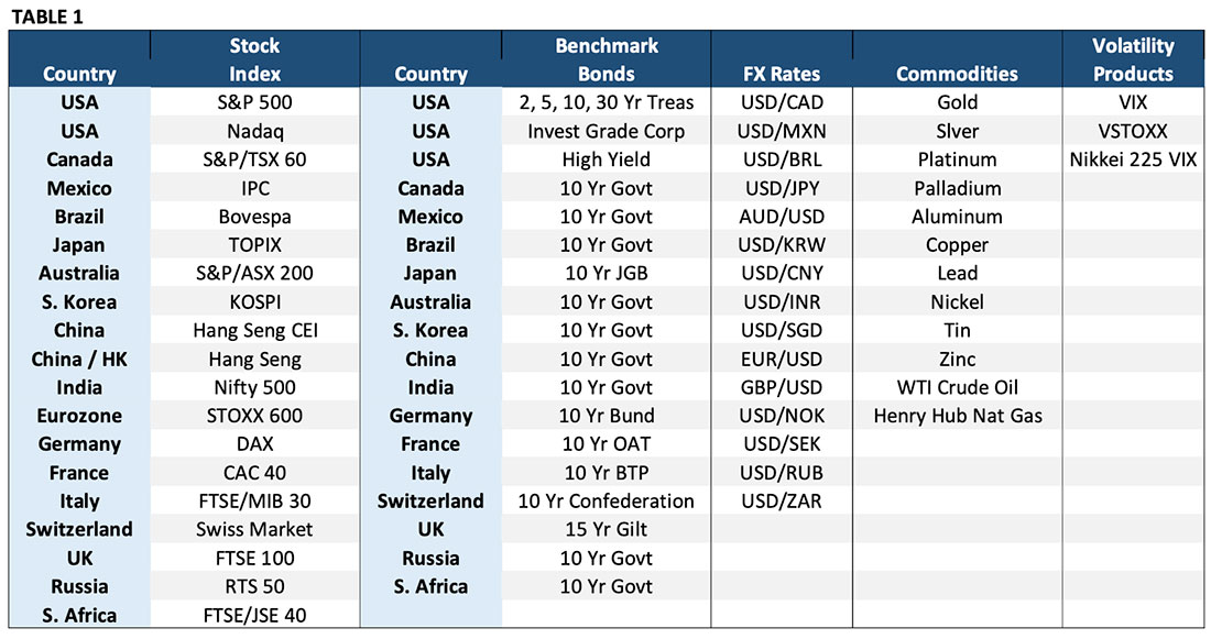
Forecasts (except for energies) are updated mid-morning the last business day of each month (crude oil and natural gas forecasts are updated on the 15th and 20th of each month, respectively). Intramonth updates may be issued in response to unusual economic or political events. Each Model predicts the one-month-ahead change in the asset price (the bond models also predict changes in bond yields). These forecasts are then used as the basis for specific position recommendations. These trade recommendations can be used alone or with other indicators such as technical analysis or sentiment indicators. Forecasts are provided in both tabular and graphical form. Both are posted on the website and sent via email to subscribers as soon as the new forecasts are available. The monthly Macro Intelligence Report is normally available the first day of each month with a detailed explanation of the factors that are driving the Model signals.
Embedded in each Composite Model is an estimate of valuation for each instrument. This measure is the Valuation Model’s best estimate of where equilibrium would be if all the information available to the market was fully and correctly incorporated into the market price. The Model then calculates the deviation from this measure to measure how over- or undervalued a market currently is. The Valuation Model then uses the deviation from fair value to determine how much the prices is likely to move over the next one month to five years based solely on the current level of valuation alone compared to how prices have performed in the past under similar levels of valuation.
Our experience is that valuation outliers are extremely valuable for making asset allocation decisions. Investments based on valuation extremes can often be the biggest source of “alpha” for investors. The reason for that is simple: the vast majority of investors, for psychological reasons, often have difficulty selling a market in a strong uptrend and buying a market that is falling sharply (how many investors sold tech stocks in August 2000 or bought the S&P 500 in February 2009?). Valuation trades can be large alpha generators because value investors get paid for assuming positions that others won’t.
The valuation forecasts do not have the precise timing of the Composite Models, but they can be very useful to value investors who are not interested in making frequent adjustments to their portfolios. They are also of value to traders and investors that want to anticipate or protect themselves against potentially large reversals in extremely over or under-valued markets.
I. Reading the Output – Composite Stock Index Models
The Composite Stock Index Models consolidate all the information (fundamental factor data, valuation measures, and market phase information) to provide their best forecasts of the one-month return. These models generate a specific forecast of the one-month change in the instrument. All the Models share this standard output format, though the fixed income and currency Models add additional information that is unique to those markets.
The Program provides its directional forecasts in table form and then converts this data into trade signals that are presented graphically. Table 2 shows the monthly output from the stock index Models in table form.
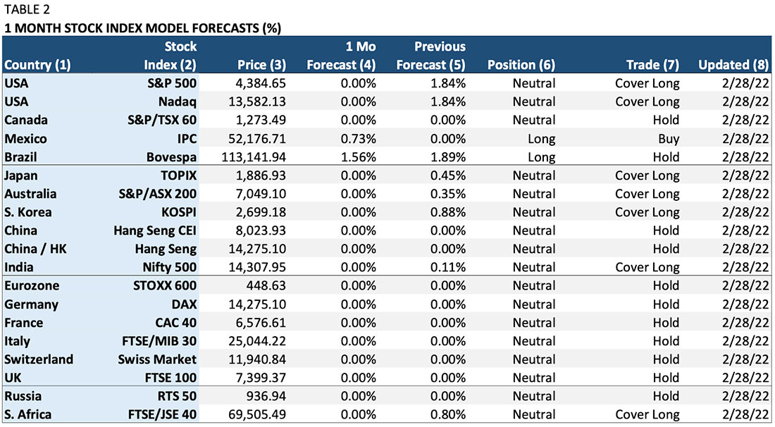
Column (1) “Country”: The country of the stock index.
Column (2) “Stock Index”: The specific stock index Model.
Column (3) “Price”: The stock index level at the time the Model was updated.
Column (4) “1 Mo Forecast”: The Model’s forecast of the expected one-month-change in the index in percent. For example, the 0.73% forecast for Mexico indicates that the Model expects the IPC Index to rise 0.73% in the next month.
Column (5) “Previous Forecast”: This column shows the expected one-month forecast for the previous month. It is relevant for determining any trades in Column (7).
Column (6) “Position”: This is the Model’s recommended position based on the one-month forecast. This column converts the percent forecast into a “long” (own the index), “neutral” (no position or “cash”), or a “short” (sell the index net short) recommendation.
Column (7) “Trade”: This column shows the change in the Model’s recommended position based on the change between the previous month’s forecast and the current month’s forecast. For example, the S&P 500 Model predicted a 1.84% rise in the index last month. The forecast for the current month dropped to zero (no expected change in the index). As a result, the trade calls for covering the “long” signal from last month (selling last month’s position) and going to neutral or “cash” (no position in the S&P 500 index).
Column (8) “Updated”: This column shows the date on which the Model forecast was updated.
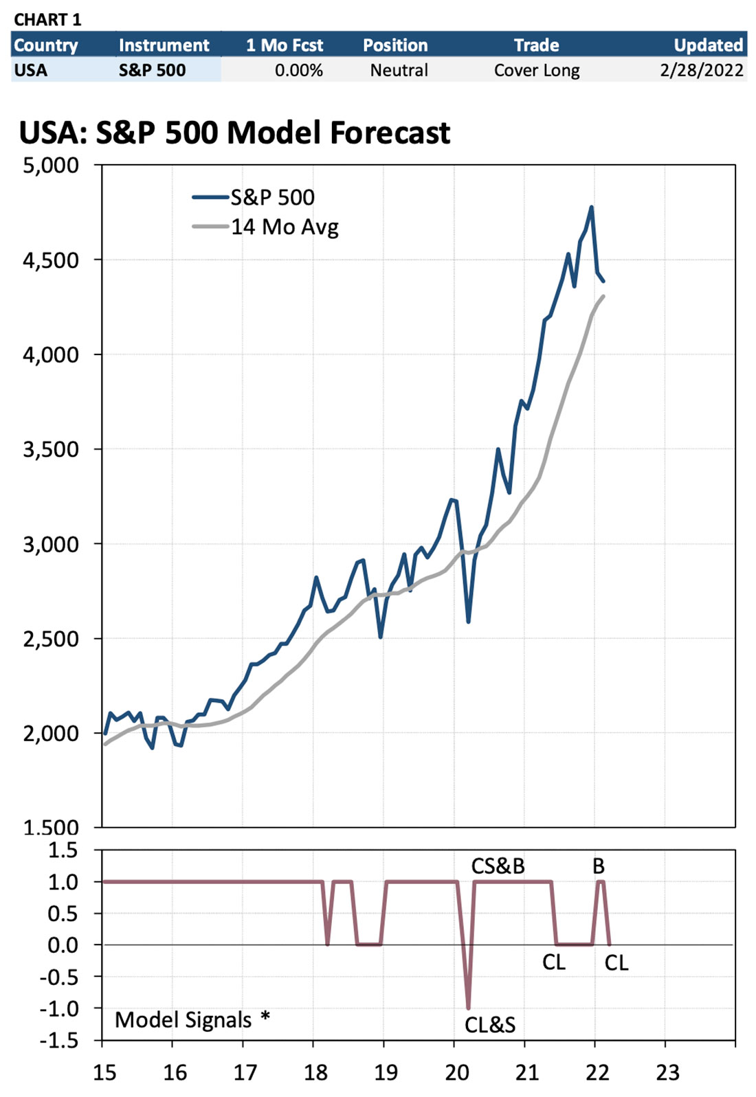
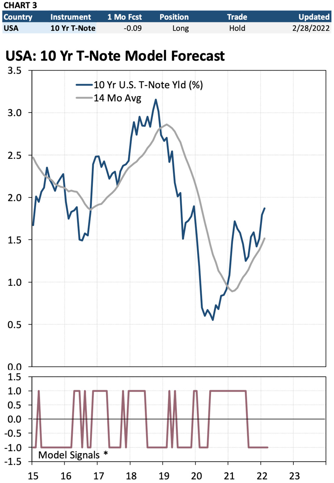
Chart 1 shows the same infor- mation as Table 2 except presented graphically. The table at the top of the chart is a summary of the data from Table 2 for just the S&P 500. The top chart is an historical graph of the stock index. The bottom chart shows all recommended trade signals for the past several years. The “Model Signals” chart shows all recommended positions as either a “1”, a “0”, or a “-1.” Positions can be summarized as follows:
1 = “long” (own the index)
0 = “neutral” or “cash” (no net position
-1 = “short” (a net short position in the index)
For example, starting in mid-2019 the Model was “long” the S&P 500 (the “1” model signal). At the end of March 2020, the Model fore- casted a sharp decline in the S&P 500 causing the Model to cover the long position and go net short (CL&S” on “-1”). At the end of May 2020, the Model generated a positive forecast for the S&P 500. That caused the Model to cover the short position and go long (“CS&B” on “1”). The Model then predicted a rising market until June 2021 when it exited the position to go “neutral” (CL on “0”). The Model held that position until December 2021 when it went “long” (“B” on “1”) before covering the long position and going neutral in February (“CL” on “0”).
The trade recommendations can be summarized as follows:
B = Buy (net long)
S = Sell (net short)
CL – Cover long (no net position)
CS = Cover short (no net position)
CL&S = Cover long and sell (move from a net long to a net short position) CS&B = Cover short and buy (move from a net short to a net long position)
The table and graph both convey the same position information. The table, however, also includes the one-month percent change forecasts which some investors may find useful to gauge the actual strength of the signals, not just their direction. The percent forecasts may also be useful to investors who use portfolio construction software to determine optimal allocations of capital.
II. Reading the Output – Stock Index Valuation Models
As part of generating the composite forecast, the Gamma Models also calculate an estimate of economic “fair value” for each asset. As with the Composite Models, the valuation forecasts are presented in tables and graphs. Table 3 is a summary of the output from the stock index valuation models.
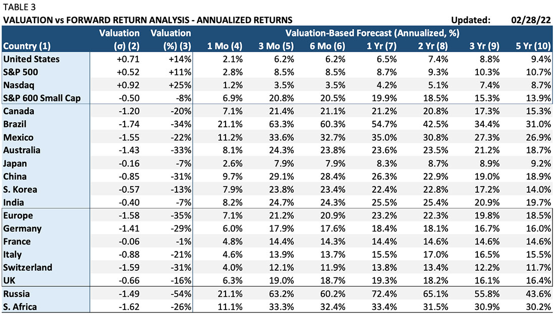
Column (1) “Country”: The country/index for which stock valuation is being calculated. Country valuations are calculated for a broad basket of small, medium, and large cap stocks.
Column (2) “Valuation (σ)”: The number of standard deviations away from fair value that the stock index is. The larger the number in absolute value, the more extreme the over or undervaluation. For example, one standard deviation (1σ) indicates a level of valuation that occurs about 33% of the time. Two standard deviations (2σ) represent valuation that occurs 5% of the time, while three standard deviation (3σ) extremes occur 1% of the time. For example, the Nasdaq is at +0.92 valuation. That level of overvaluation occurs about 35% of the time. Brazil, at -1.74 standard deviations, is at a level of undervaluation typically seen only about 10% of the time.
Column (3) “Valuation (%)”: This column shows the calculated level of over- or undervaluation based on the Valuation Model. For example, the S&P 500 at +0.52 standard deviations is overvalued by about 11%. The index would need to drop 11% in order to reach a level at which all relevant information is fully and correctly incorporated into the market price. On the other extreme, the Brazilian market is -34% undervalued. It would need to rise 34% from its current level to return to fair value equilibrium.
Columns (4-10) “Valuation-Based Forecast (Annualized, %)”: These columns show the expected annualized returns for the stock index for one-month through five-year time horizons based solely on current valuation. These valuation-based forecasts are based on what the one-month to five-year returns have historically been following the current levels of valuation. Extreme valuation has historically been followed by mean-reversion. Extreme overvaluation has invaria- bly been followed by substantially below-average returns. Periods of extreme undervaluation have been followed by well above-average returns.
Chart 2 shows a stock index (S&P 500) compared to its current and historical valuation. As with the Composite Forecast charts, the table across the top is a summary of the valuation data from Table 3. It includes the level of over or undervaluation in standard deviation and percentage terms plus the expected valuation-based one and three-year returns. The top chart presents the stock index; the lower chart shows valuation in standard deviations from +3 to -3. Extreme positive valuation is associated with lower future returns; extreme undervaluation is associated with higher future returns.
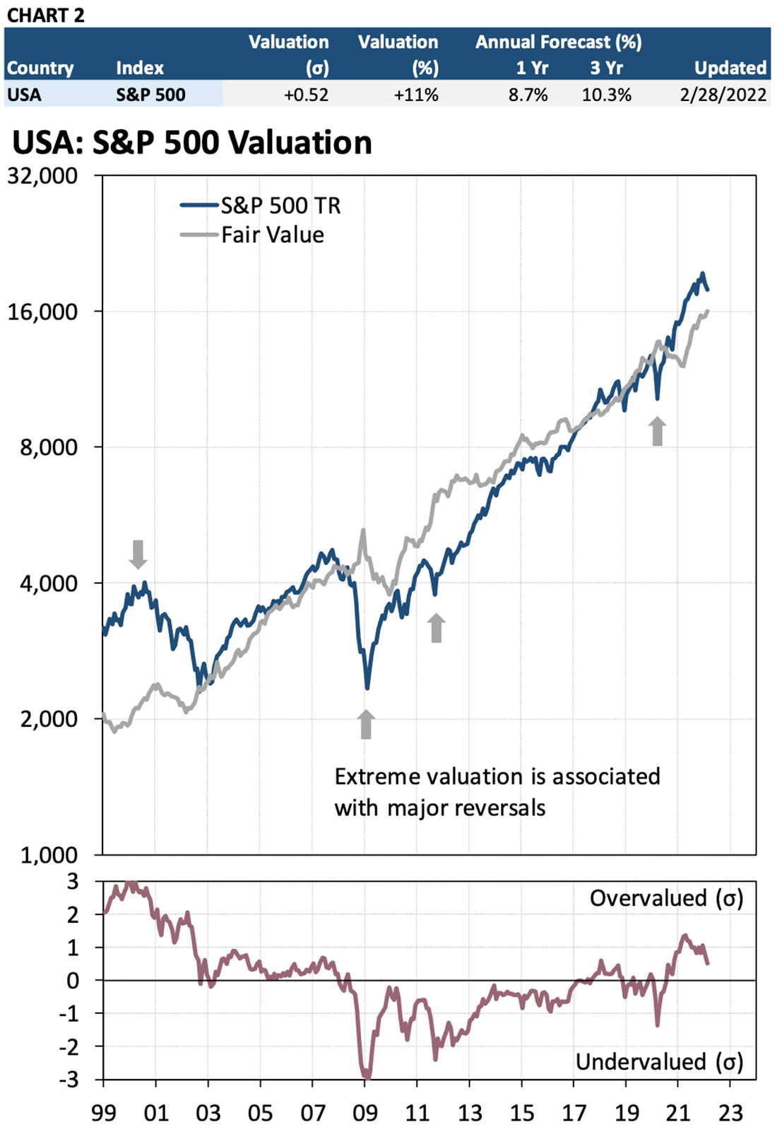
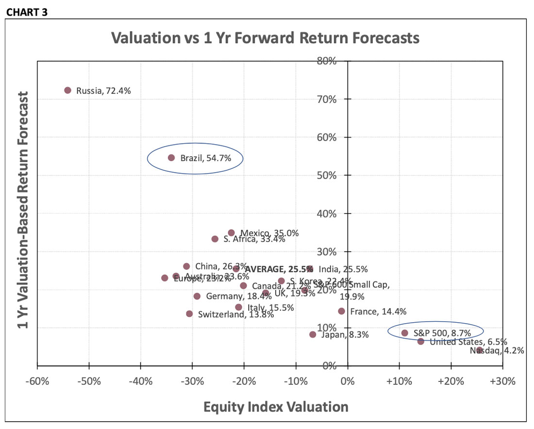
Chart 3 is a comparative scatter chart that shows the current valuation of the stock indexes in Column 1 of Table 3 plotted against the valuation-based one-year forecast. For example, the S&P 500, in the lower right, shows a current overvaluation of 11% (0.52 standard deviations). The expected 1-year return based on this valuation is 8.7%, below the index’s 10% long-term return.
Conversely, Brazil is in the upper left with a current undervaluation of -34% (-1.74 standard deviations). That is -60% associated with a well above-average expected return of 54.7% in the next year due to the mean-reversion that typically follows valuation extremes.
III. Reading the Output – Composite Fixed Income Models
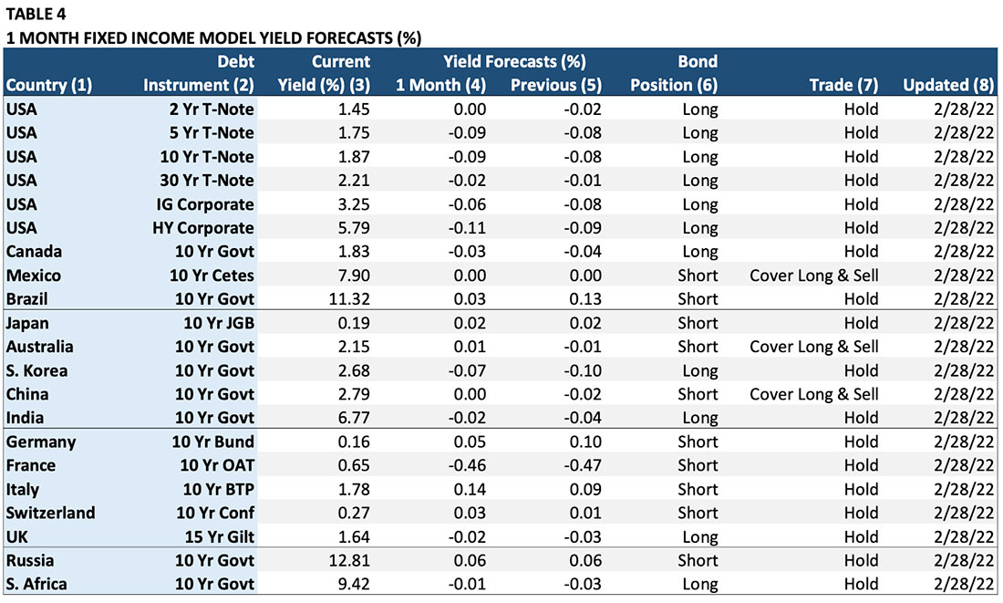
The output for all the asset classes is similar in the sense that each includes a one-month forecast of the asset, a graph of the recommended positions, an estimate of current value, and a return forecast based on valuation. The fixed income and foreign exchange Model output is shown somewhat differently due to the way that prices are expressed in these markets. Table 4 shows the output of the Fixed Income Models.
Column (1) “Country”: The country of the fixed income instrument.
Column (2) “Debt Instrument”: The specific fixed income note, bond, or index. Column (3) “Current Yield”: The yield at the time the Model was updated.
Column (4) “1 Mo Yield Forecast”: The Model’s forecast of the expected one-month-change in the yield. For example, the -0.09% forecast for the U.S. 10 Year Treasury Note indicates that the Model expects the T-Note yield to fall be -0.09% in the next month. To reiterate, the forecast is for the change in the yield, NOT the bond price. We emphasize this because fixed income instruments are quoted in both yield and price terms.
Column (5) “Previous Forecast”: This column shows the expected one-month forecast for the previous month. It is relevant for determining any trades in Column (7).
Column (6) “Position”: This is the Model’s recommended position based on the one-month forecast. For example, the recommended position for the U.S. 10-year Treasury Note is “long” based on the lower yield forecast in Column (4) (-0.09%) because lower yield = higher note price.
Column (7) “Trade”: This column shows the change in the Model’s recommended position based on the change between the previous month’s forecast and the current month’s forecast. For example, the Model for the 10-year Australian government bond is forecasting a 0.01% rise in yield compared to a -0.01% decline the previous month. Since a forecast of rising yields equals a lower bond price, the Model covers the existing “long” position and goes “short.” To reiterate, forecasts are for the change in yield; position and trade recommendations are for the note, bond, or bond index.
Column (8) “Updated”: The date when the Model was updated.
IV. Reading the Output – Fixed Income Valuation Models
The valuation data for the fixed income Models are presented similarly to the stock index data. Table 5 shows the valuation measurements and predicted valuation-based forecasts of changes in instrument yields.
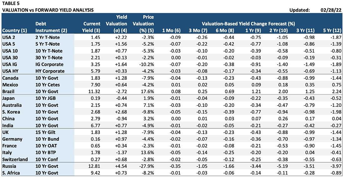
Column (1) “Country”: The country for which the fixed income instrument is being calculated.
Column (2) “Debt Instrument”: The specific fixed income note, bond, or index.
Column (3) “Current Yield”: The yield at the time the Model was updated.
Column (4) “Valuation (σ)”: Over- and under-valuation is expressed in standard deviations in yield away from fair-value. The larger the number in absolute value, the more extreme the over- or under- valuation.
Column (5) “Price Valuation (%)”: This column shows valuation calculated as the percent difference between the instrument price (not yield) and the fair-value price.
The combination of yield and price calculation is due to the nonlinear relationship between yield and price. A 1 basis point change in yield (1/100 of 1%) has much more of an effect on price when yields are at 2% rather than 10%. Attempting to calculate an accurate measure of mispricing using the percent deviation from fair value applied to yields can produce deceptive results when bond yields are very low.
Columns (6) – (12) “Valuation-Based Yield Change Forecast (%)): These columns show the expected change in yields over different time horizons based on the current level of valuation. For example, the yield on U.S. 5 Year Treasury Note is 1.56 standard deviations above its predicted fair-value level. As a result, the one-year forecast based on this valuation alone calls for the yield to decline by 0.77% over the next 12 months.
V. Reading the Output – Composite Foreign Exchange Models
The Composite Foreign Exchange Model generates trade recommendations using the standard currency conventions used in the foreign exchange market. The FX Model output is displayed in Table 6.
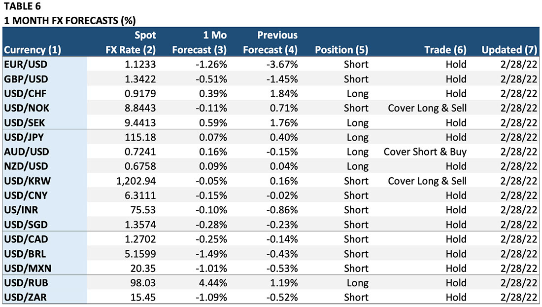
Column (1) “Currency”: The currency pair. Forecasts and trade recommendations are for the first currency in the listed pair. For example, for EUR/USD the forecast is for the percent change in the Euro, not the U.S. dollar (USD). The position and trade recommendations also refer to the Euro, not the U.S. dollar. For USD/JPY, the exact opposite is true. The forecast is for the U.S. dollar as are the position and trade recommendations.
Column (2) “Spot FX Rate”: The spot exchange rate at the time the Model was updated.
Column (3) “1 Mo Forecast”: The Model’s forecast of the expected one-month-change in the first currency of the currency pair. For example, the -1.26% forecast for EUR/USD indicates that the Model expects the Euro to decline -1.26% against the dollar in the next month. Conversely, the 0.07% forecast for USD/JPY predicts that the dollar will rise 0.07% against the yen in the next month.
Column (4) “Previous Forecast”: This column shows the expected one-month forecast for the previous month. It is relevant for determining any trades in Column (6).
Column (5) “Position”: This is the Model’s recommended position based on the one-month forecast. This column converts the percent forecast into a “long” (own the first currency / sell the second cur- rency), “neutral” (no position), or a “short” (sell the first currency / buy the second currency) recommendation.
Column (6) “Trade”: This column shows the change in the Model’s recommended position based on the change between the previous month’s forecast and the current month’s forecast. For example, the AUD/USD Model shows that last month’s prediction of a -0.15% decline in the Australian dollar has now reversed to a forecast of a +0.16% gain for the Australian currency. As a result, the Model recommends covering the previous “short” position and buying Australian dollars / selling U.S. dollars. The trade leaves the investor “long” Australian dollars and “short” U.S. dollars.
Column (7) “Updated”: This column shows the date on which the Model forecast was updated.
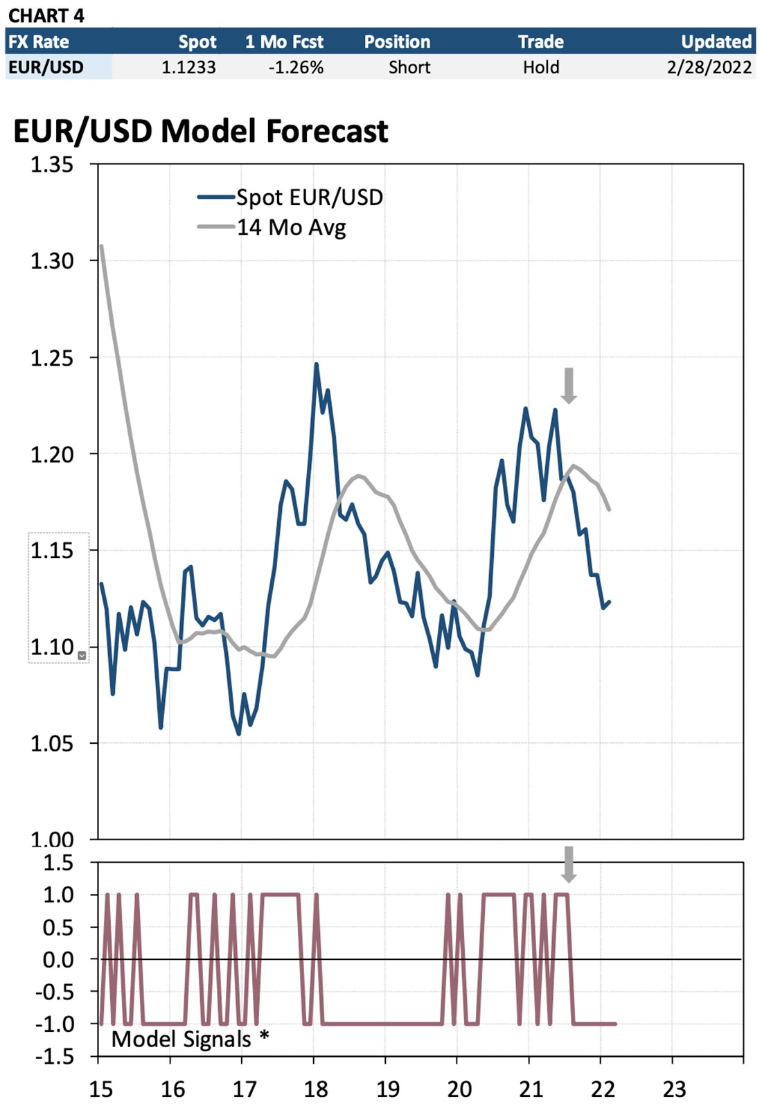
Chart 4 shows the information 12 from Table 6 graphically. The table at the top of the chart is a summary of the forecast and trade information from Table 6. The top chart is an historical graph of the exchange rate. The bottom chart shows all recommended trade signals for the past several years. The “Model Signals” chart shows all recommended positions for the first currency in the currency pair as ei- ther a “1”, a “0”, or a “-1” repre- senting a “long”, “neutral” or “short” position.
For example, the most recent sig- nal shows the Model reversing a “long” EUR/USD position to a net short EUR/USD position in August 2021. The Model continues to hold the short position as the monthly forecasts continue to predict a de- cline in the Euro.
VI. Reading the Output – Foreign Exchange Valuation Models
Interpreting the output from the Foreign Exchange Valuation Models is similar to the stock index and fixed income Models. Table 7 shows a sample output from the Valuation Models.
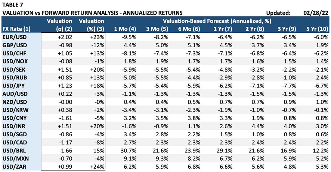
Column (1) “FX Rate”: The currency pair. As for with the forecasts and trade recommendations, valuation is expressed for the first currency in the currency pair.
Column (2) “Valuation (σ)”: The over- or under-valuation in standard deviations.
Column (3) “Valuation (%)”: Shows the degree of mispricing in percent deviation from the first cur- rency’s estimated economic fair value.
Columns (4) – (10) “Valuation-Based Forecast (Annualized, %): These columns show the expected annualized returns for the first currency for one-month through five-year time horizons based solely on current valuation. These valuation-based forecasts are based on what the one-month to five-year returns have historically been following the current levels of valuation.
For example, consider the EUR/USD exchange rate. Column (2) shows that the Euro is 2.02 standard deviations overvalued against the U.S. dollar. Column (3) indicates that the 2.02 standard deviation translates into a 23% overvaluation (the Euro would need to fall 23% in value to reach its equilibrium fair value level). Based on historical experience, a two standard deviation level of overvaluation has been associated with a -6.4% decline in the next 12 months (Column (7)). The Model also suggests that the 23% overvaluation may take several years to eliminate. Column (9) indicates that the Euro is expected to decline against the dollar by an average of -6.5% over the next three years.
VII. Reading the Output – Composite Commodity Models
The Commodity Models are the most straightforward of any of the asset classes because all forecasts, trade signals, and valuation measures are in terms of a specific commodity. Table 8 shows a sample summary of the commodity Model forecasts and trade signals.
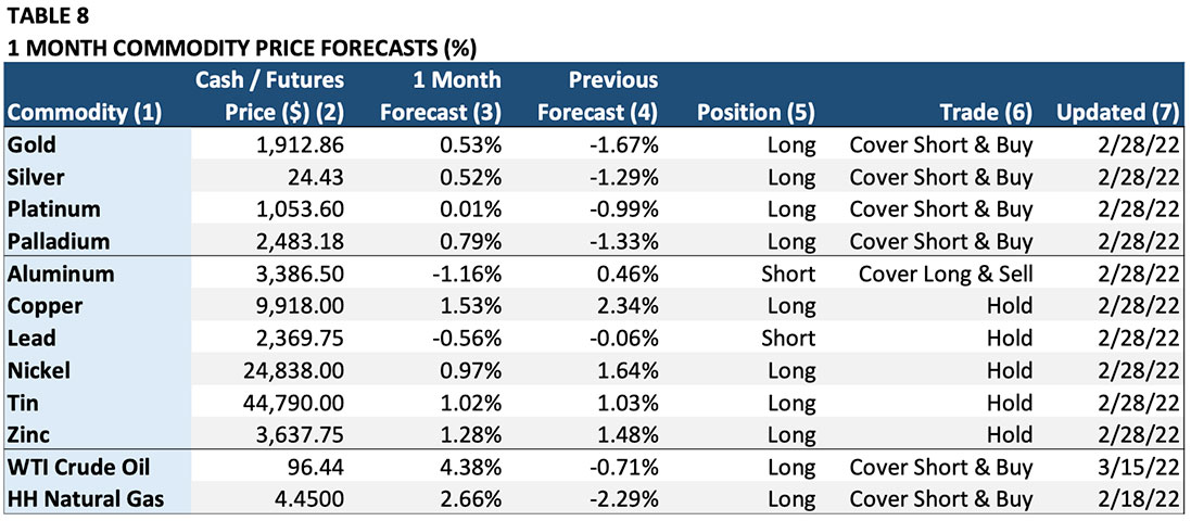
Column (1) “Commodity”: The commodity to which the forecast and trade recommendation applies.
Column (2) “Cash/Futures Price ($)”: The commodity price at the time the Model was updated.
Column (3) “1 Month Forecast”: The Model’s forecast of the expected one-month-change in the com- modity price in percent (%). For example, the 0.53% forecast for gold indicates that the Model expects the gold price to rise 0.53% in the next month.
Column (4) “Previous Forecast”: This column shows the expected one-month forecast for the previous month. It is relevant for determining any trades in Column (6).
Column (5) “Position”: This is the Model’s recommended position based on the one-month forecast. This column converts the percent forecast into a “long” (own the commodity), “neutral” (no position or “cash”), or a “short” (sell the commodity net short) recommendation.
Column (6) “Trade”: This column shows the change in the Model’s recommended position based on the change between the previous month’s forecast and the current month’s forecast. For example, the gold Model predicted a -1.67% drop in price last month. The forecast for the current month calls for a 0.52% rise in the gold price. As a result, the trade calls for covering the “short” signal from last month and going “long” by buying gold.
Column (7) “Updated”: This column shows the date on which the Model forecast was updated.
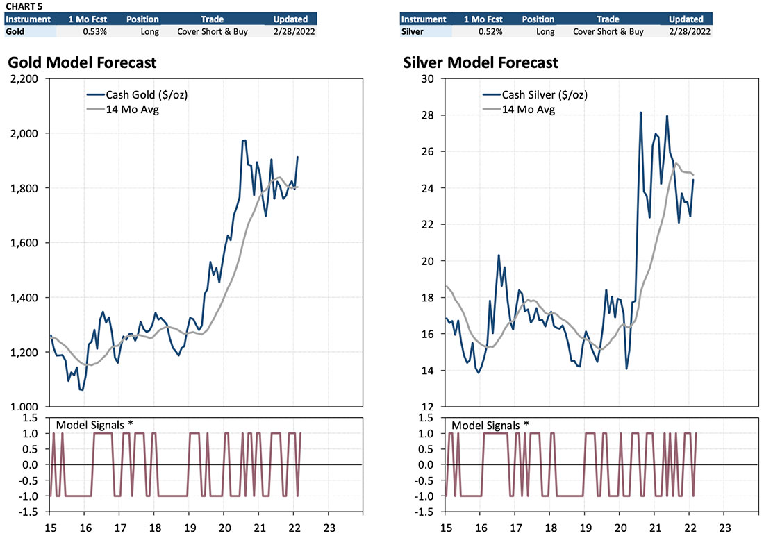
Chart 5 is a graphical presentation of the forecast and trade information in Table 8 for gold and silver. The table across the top shows a summary of the one-month price change forecast, the current position based on the forecast, the recommended trade (if any), and when the forecast was updated. Each chart below the forecast summary shows a graph of the commodity. The “Model Signal” graph below the commodity chart shows the trade signals from the Composite Commodity Model. Trade signals can be “1” (long the commodity), “0” (neutral; no net position), and “-1” (net short). For example, the “Cover Page | Short & Buy” signal for gold for the most recent month shows the change from a net short to a net long 15 position (-1 to +1) due to the monthly price change forecast swinging from -1.67% to 0.53%.
VIII. Reading the Output – Commodity Valuation Models
As with the Stock Index, Fixed Income, and Foreign Exchange Models, the Gamma Models calculate an estimate of economic “fair value” for each commodity. This measure is the Model’s best estimate of where equilibrium would be if all the information available to the market was fully and correctly incorporated into the market price. Valuation is then determined by the size of the deviation from this measure. Interpreting the output from the Commodity Exchange Valuation Models is similar to the other asset class Models. Table 9 shows a sample output from the Commodity Valuation Models.
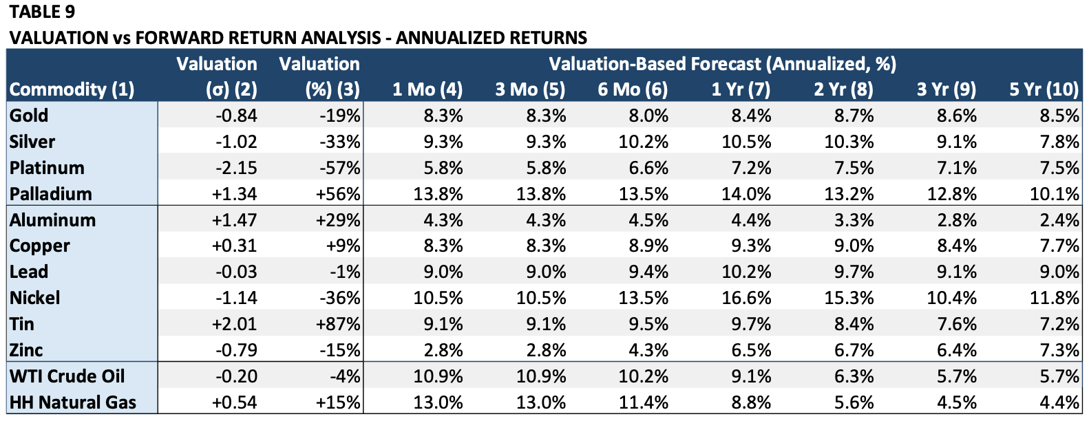
Column (1) “Commodity”: The commodity for which valuation and valuation-based forecasts are being calculated.
Column (2) “Valuation (σ)”: The degree of divergence from fair value measured in standard deviations.
Column (3) “Valuation (%)”: Shows the de- gree of mispricing in percent deviation from the commodity’s estimated economic fair value. For example, Platinum is -2.15 stand- ard deviations undervalued which translates into -57% undervaluation (platinum would need to rise in price by 57% from its current price to get to equilibrium).
Columns (4) – (10) “Valuation-Based Forecast (Annualized, %): These columns show the ex- pected annualized returns for the commodity for one-month through five-year time horizons based solely on current valuation. For exam- ple, silver which is undervalued -33% is ex- pected to rise 10.5% in the next year.
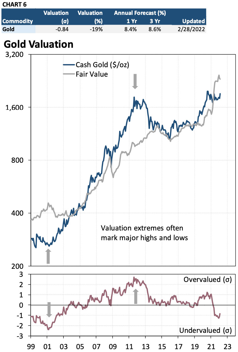
Chart 6 shows the data in Table 9 graphically since 1999. The top table summarizes the data from Table 9. The top chart presents the cash gold price during that period. The bottom chart shows the calculated valuation in stand- ard deviations. Major reversals are often pre- ceded by valuation extreme in excess of ±1.75 standard deviations.

